2018/12/30 - go to articles list
When the basic launch screen is actually too basic.
Creating a good launch screen is always a challenge. Creating a good launch screen while being compliant to Apple guidelines is a challenge even more. Since the approach Apple recommends actually makes sense (at least for me), it surprised me how hard it is to make it right, and how uncommon it is to see it done.
In this article, I will present briefly a few minor things I struggled with while trying to balance between custom UI and recommended approach. To be fair, I have to say that the majority of apps just slide over the topic and just place logo as a splash screen. I've done that as well, more than once. But this time I wanted to do it as close to "by the book" as possible. I will try to sum this up in a few points as possible.
I don't want to rewrite what is already done, as Apple already has a section in guidelines for Launch Screen.
Human Interface Guidelines - Launch Screen
The guidelines for Launch Screen are not long and can be summarised in just few bullet points:
From my experience, the last point is kind of dead, a lot of apps does exactly that and I never heard about any review issues because of that.
The outlined points are what I actually wanted to achieve. I wanted to make a very lightweight launch screen, that actually reassembles the first screen of the app.
Ok, that seems fairly easy, right? Let's see how does it look:
To have something similar to what Apple shows as an example, I should then:
Also, I decided to not to keep any "interactive" elements on the screen while the app is loading so all buttons would be gone. It would look something like one of the following:

I actually went for the second option, as I did not want to give up branding completely. I left screen title as well; it is not localized, so it would not be a problem, and it will actually reduce the number of differences between launch and first screen of the app.
The first and biggest challenge is that we cannot use any custom classes. That means that no actual code would be executed! So all we do has to be possible to setup through IB. Another limitation (that was not obvious for me at the beginning) is no custom runtime attributes.
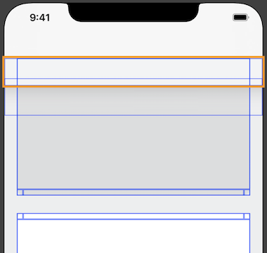
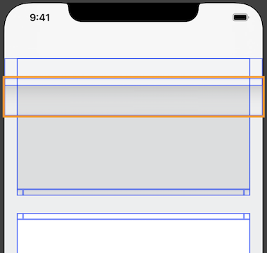
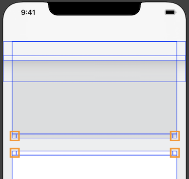
Navigation Bar:
Another challenge was with the navigation bar. Fortunately, we can use UINavigationController, UITabBarController etc., as long as we are fine with its default look (or the level of customization available from IB).
In my case, I was extending navigation bar with this top menu thing (noticed this small line on screenshots from storyboard?). Fortunately, I was able to set empty image (1 transparent pixel) as navigation bar shadow image. Then I can extend it with plain UIView:
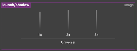
Shadows:
There is no way to use built-in shadows - no shadow layer available, nor runtime attributes. Which means that I had to generate shadow beforehand, and use it as an image. I've just used an UIImageView with "scale to fill" mode, and a thin slice of vertical shadow:
Borders:
In my case, I actually skipped borders. The actual problem here is, again, no runtime attributes to set it on the layer level. If you need borders, you will have to make them from separate UIView's.
Rounded corners:
I have to admit, that this gave me a lot of troubles. There are no custom runtime attributes so we cannot change any of the layer properties. The approach is the same as last time, we can just pre-render rounded corners and use images instead of drawing.
As a first approach, I just generated 4 assets, one for every corner (@1x @2x @3x), giving in total 12 images. I made them white, hoping that setting image mode to "always template" will let me control corners color using tint.
Unfortunately, for some reason, my corners were ignoring tint color. The problem I had with this approach was the actual number of assets I had to generate. Maintaining separate images for every corner, scale, and color (I needed white and light grey) was giving quite a big number of assets.
The solution proved to be straightforward (at least when looking at it now). When you look at it in a more general way, four corners (with radius 10pt in my case) could be actually combined into one image.

Then, the one last thing to resolve is to how to control, which part of the combined image is used (and so which actual corner is drawn). It could be done by setting image view "content mode" to one of the following:
I have to admit, that this is actually the first time, I used this content mode.
This approach to combining several images into one asset or atlas is quite common, but I've never seen it in iOS (at least in a non-game context). Even if it's so straightforward, I was very happy to find it out :)
Final effect below: